Designing Inclusive Forms in Vibe-Coded Apps: Labels, Errors, and ARIA

- Mark Chomiczewski
- 15 March 2026
- 7 Comments
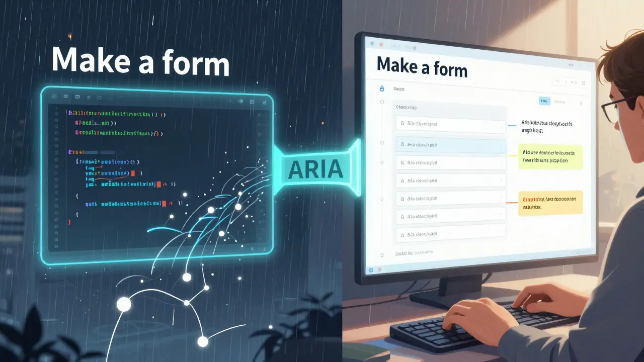
When you build a form using a vibe-coded app-where AI writes most of your code-do you ever stop to ask: Can someone using a screen reader actually fill this out? The truth is, most AI-generated forms fail at the most basic accessibility tasks. They skip labels. They bury error messages in plain text. They slap on ARIA attributes like decoration, not function. And if you don’t catch it before launch, you’re locking people out of your service-people who rely on assistive tech just to get through your signup flow, checkout, or contact form.
AI tools like Cursor, Replit, and GitHub Copilot are fast. They turn a quick prompt like "make a login form" into working code in seconds. But they don’t know what accessibility means unless you tell them-and even then, they often get it wrong. A 2025 Deque study found that 78% of AI-generated forms had missing or misused labels. Another 62% didn’t announce errors to screen readers. That’s not a bug. It’s a systemic blind spot.
Why Labels Are the First Thing That Breaks
Every form input needs a label. Not a placeholder. Not a nearby paragraph. A real, properly associated label. But when you ask an AI to "add labels to this form," it often generates something like this:
<input type="email" placeholder="Email">That’s not a label. That’s a hint. Screen readers ignore placeholders. Keyboard users can’t tab to them. People with cognitive disabilities don’t know what the field is for once they start typing. The correct way is:
<label for="email">Email address</label>
<input type="email" id="email">
Or, if you’re nesting it:
<label>
  Email address
  <input type="email">
</label>
AI tools don’t always pick up on this. They’ve been trained on codebases full of placeholder-based forms. So you have to be explicit: "Use explicit <label for="..."> associations for all form fields. No placeholders as substitutes." If you don’t say that, the AI will default to the easiest, most common-but least accessible-pattern.
Errors Don’t Just Appear. They Must Be Announced.
Imagine typing your password, hitting submit, and seeing "Password too short" below the field. Sounds fine, right? But if that text is just a regular <p> tag, a screen reader won’t notice it. The user might think the form didn’t submit at all.
Accessible error handling needs two things: visibility and announcement. The error must be visually near the field, and it must be announced by the screen reader as soon as it appears. The standard way is:
<label for="password">Password</label>
<input type="password" id="password" aria-invalid="true" aria-describedby="password-error">
<div id="password-error" role="alert" aria-live="polite">Password must be at least 8 characters.</div>
Notice the role="alert" and aria-live="polite". That’s what tells the screen reader: "Hey, something changed here. Tell the user." Most AI tools don’t generate this. They just drop the error message as plain text. You have to prompt for it: "When validation fails, use an element with role='alert' and aria-live='polite' to announce errors. Link it to the input using aria-describedby."
And don’t forget: errors should be clear, specific, and helpful. AI often generates vague messages like "Invalid input." That’s useless. Instead, say: "Your phone number must include 10 digits. Include the area code."
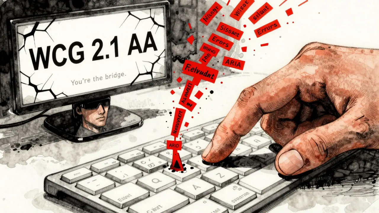
ARIA Isn’t Magic. It’s a Bridge.
People treat ARIA like a magic spell. Add aria-label, and suddenly it’s accessible. But ARIA doesn’t fix bad HTML. It just adds a layer on top. If your form uses <div> buttons or <span> inputs, ARIA won’t save you. It’ll just confuse screen readers.
Here’s what ARIA should do in forms:
- aria-label: Only when a visible label isn’t possible (like an icon-only button).
- aria-describedby: To link an error message or hint to its input.
- aria-invalid: To signal when a field has an error (always pair with a visible error message).
- aria-required: To indicate a required field (but don’t skip the visual asterisk or "required" text).
AI tools often misuse these. They’ll add aria-label="Submit" to a button that already says "Submit." That’s redundant. Or they’ll add role="button" to a <div> but forget tabindex="0" and keyboard events. That’s worse than not using ARIA at all.
Don’t let the AI guess. Be specific: "Use ARIA only to enhance semantic HTML. Never replace it. Always pair aria-describedby with a visible error message. Never use aria-label on elements with visible text."
How to Fix This Before It’s Too Late
You can’t rely on AI to get forms right. You have to build checks into your workflow. Here’s how:
- Write accessibility into your prompt. Don’t say "Make a form." Say: "Create a form with explicit labels, error messages announced via role='alert', and ARIA attributes only where needed to enhance semantic HTML. Follow WCAG 2.1 Level AA for form accessibility."
- Test with axe or similar tools. Tools like axe MCP Server can scan your vibe-generated code and flag missing labels, unannounced errors, or incorrect ARIA. Run it before you commit.
- Review manually. Open your form in a screen reader (VoiceOver, NVDA, or JAWS). Tab through every field. Submit with errors. Listen. Does it say "Password error"? Does it say where? Can you hear the error without looking at the screen?
- Test with keyboard only. No mouse. Can you tab to every field? Can you tab out of dropdowns? Can you submit with Enter?
- Build validation into CI/CD. Add an accessibility linter to your build pipeline. If the form fails, it shouldn’t deploy.
There’s no shortcut. Vibe coding speeds up development, but accessibility isn’t something you can automate away. It’s a discipline. It’s a habit. It’s a conversation you have with your AI-over and over.
What Happens When You Ignore This
Forms aren’t just UI elements. They’re gateways. If someone can’t submit their application, sign up for healthcare, or complete a payment because your form breaks for screen readers-they don’t blame the AI. They blame you.
In 2025, a major U.S. government portal was sued because its AI-generated registration form didn’t announce errors. Users with visual impairments couldn’t complete the process. The lawsuit wasn’t about design. It was about exclusion. And it cost the agency $1.2 million in legal fees and remediation.
That’s the cost of assuming AI knows what’s right. It doesn’t. Not yet. Not without you.
You’re the Bridge
AI gives you speed. But you give it meaning. You’re the one who knows that a label isn’t just text-it’s a lifeline. That an error message isn’t just feedback-it’s direction. That ARIA isn’t a decoration-it’s a translator.
So the next time you type "build me a form," don’t just hit enter. Say: "Make it accessible." Then check it. Then test it. Then fix it. Because the fastest code in the world is useless if no one can use it.
Can AI-generated forms pass WCAG accessibility standards automatically?
No. As of 2026, no AI tool generates fully accessible forms without human oversight. AI tools are trained on codebases that include widespread accessibility failures. They often omit labels, misapply ARIA, or fail to announce errors. Even when prompts include accessibility requests, AI still misses critical patterns. Manual review and testing with screen readers are required to meet WCAG 2.1 Level AA standards.
What’s the most common accessibility mistake in AI-generated forms?
The most common mistake is using placeholder text instead of proper <label> elements. Screen readers ignore placeholders once a user starts typing. This leaves people with visual or cognitive disabilities without context for what they’re filling out. AI tools default to placeholders because they’re easy to generate-but they’re not accessible.
Do I need to use ARIA for every form field?
No. ARIA should only enhance semantic HTML, not replace it. If you use proper <label>, <input>, <button>, and <fieldset> elements, most forms will work without ARIA. Use ARIA only when you need to communicate something that HTML can’t, like linking an error message to a field with aria-describedby or indicating a required field with aria-required="true".
How do I test if my form is accessible?
Use a screen reader (like VoiceOver on Mac or NVDA on Windows) and navigate the form with only your keyboard. Tab through each field. Submit with errors. Listen: does the screen reader announce the label, the error, and the field status? Also run an automated checker like axe or Lighthouse. But remember: automated tools miss 30-40% of accessibility issues. Real testing with assistive tech is non-negotiable.
Should I include accessibility in my AI prompts?
Yes. Always. Be specific. Instead of "Make a form," say: "Create a form with explicit labels, error messages announced via role='alert', and no ARIA unless it enhances semantic HTML. Follow WCAG 2.1 Level AA. Use aria-describedby to link errors to inputs." The more precise your prompt, the better the output. AI doesn’t know accessibility unless you teach it.


Comments
Jason Townsend
AI doesn't care if you're blind. It just spits out code that looks pretty. You think you're saving time? Nah. You're just building walls for people who can't see them. I've seen government sites crash because some dev said "make a form" and the AI used placeholders. No labels. No alerts. Just silence. Then the lawsuit hits. And guess who pays? Not the AI. You do. Always you.
Stop trusting the machine. Start checking every input. Like, right now. Before you commit. Because one day, someone's gonna need that label to get a job, or healthcare, or food. And if you didn't check? You killed that chance. With your laziness.
Test it. With a screen reader. Today. Not tomorrow.
They're not asking for much. Just a label. And you won't even give it.
March 16, 2026 AT 15:20
Antwan Holder
Oh my god. This is the most profound thing I’ve read all year. You just articulated the silent scream of every person who’s ever been locked out of a website because some overconfident dev thought "placeholder = label" and called it a day.
AI is the new corporate ghostwriter. It writes your code, your emails, your love letters - and then vanishes when the system fails. And who gets blamed? The user. The disabled person. The person trying to sign up for insulin. Not the guy who typed "build me a form" and hit enter like it was a TikTok dance.
We’re not just coding websites anymore. We’re coding human dignity. And right now? We’re failing. Spectacularly. Like a Shakespearean tragedy where the hero forgets his lines and the audience just… stops breathing.
Thank you. For saying it out loud. For not letting the machine win.
March 18, 2026 AT 08:28
Angelina Jefary
First of all - it’s "aria-describedby", not "aria describedby". Stop misspelling it. Second - you think AI is the problem? No. It’s YOU. You’re the one who doesn’t read the docs. You’re the one who copy-pastes from Stack Overflow without checking if it’s WCAG compliant. You’re the one who says "it works on my machine" and moves on.
I’ve seen devs add 12 aria attributes to a button that already had a
March 18, 2026 AT 22:41
Jennifer Kaiser
I’ve worked with screen reader users for over a decade. And what breaks my heart isn’t the missing labels - it’s the silence after they say, "I can’t use this site." Not because it’s hard. But because no one cared enough to ask.
AI doesn’t hate accessibility. It doesn’t even know what it is. But we do. And we’re the ones who chose to let it slide. We optimized for speed. For aesthetics. For the CEO’s demo. We didn’t optimize for the person in the back row who needs to hear the error.
This isn’t about code. It’s about empathy. The label isn’t just an element. It’s a voice. The error message isn’t just text. It’s a lifeline.
So next time you type "build me a form," pause. Breathe. Ask yourself - who’s going to use this? And will they feel seen?
Because they’re already waiting. And they’re not asking for much.
March 19, 2026 AT 21:24
TIARA SUKMA UTAMA
Use labels. Not placeholders. Test with a screen reader. That’s it. Done. You’re welcome.
March 21, 2026 AT 16:57
Jasmine Oey
OMG I’m literally crying. This post is so deep. Like, wow. I didn’t realize how much I’ve been part of the problem until now. I used to think ARIA was just for fancy buttons. But now I get it - it’s about *soul*. Like, when you add role=alert, you’re not just coding - you’re saying "I see you" to someone who’s been invisible for too long.
And AI? Honey, it’s just a tool. Like a hammer. If you use it wrong, you smash your thumb. But if you learn? You build something beautiful.
I’m gonna rewrite all my forms today. And I’m gonna tag my boss. And my team. And my ex. (He never liked me anyway.)
Thank you for being brave enough to say this. I’m not just a dev anymore. I’m a bridge. 🌉💖
March 22, 2026 AT 05:42
Marissa Martin
I appreciate the intent behind this post. Truly. But I wonder - are we overcomplicating this? Maybe the real issue isn’t AI. Maybe it’s that we’ve lost the habit of slowing down. Of reading. Of caring.
I used to review every line of form code. Now I just hit "commit". And I’m not proud of it.
Maybe the solution isn’t more prompts. Or more ARIA. Maybe it’s just… remembering. That someone, somewhere, is trying to get through your form. And they deserve better than convenience.
I’m going to start again. Slowly. One label at a time.
March 22, 2026 AT 23:00